July 13, 2016 / by attila / In news
Childhood's End
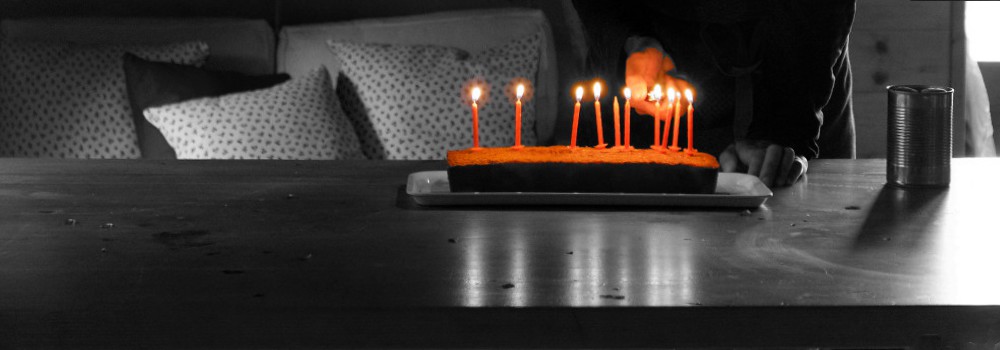
o7
O7 to all, who participated in Project Discovery! With more than 10 million classifications the project is no longer in its infancy. Thank you all for this amazing three months. We hope that soon we’ll have many new and interesting things coming up. Stay tuned!
As a full disclaimer I have been writing this post for more than a month now but somehow never managed to publish it, so the three month is now rather four and the 10 million classifications is 13.109.057 - so on the photo there should be more than 10 candles :) Keep up the great work!
But without further ado, let’s dive into the data! The data we analyzed were classifications submitted between 9th March and 10th July.
Daily classifications
The number of classifications is a good indicator of the throughput capabilities of a citizen science system. Even though there is no new goal to reach, no new type of shiny Sisters of EVE Advanced Combat Suit to buy for Analysis Kredits, activity is still very high. Of course classification numbers are dropping, which we consider completely normal. We expect that with new projects/rewards the activity will rise again. Be sure to check out these threads on the EVE forums and on Reddit discussing the subject.
Player score distribution on non-training images at the time of submission
This chart shows players' scores rising and at around 60-70% of the players are submitting classifications to the project with a near perfect score. This is partly because of natural progress and also because the players with higher scores have a higher chance to stick with the feature. It also shows that the new, harder training tasks didn't have a negative effect on active players' accuracy scores.
Training images score distribution
This chart shows the actual scores given to classifications submitted to training tasks. We see a couple of days between the 10th and 15th day, where 0.9-1 scores reached a 70% peak. This is something to investigate a bit further in the future. Also we see that the introduction of new, more complex training images opened the spectrum of classification quality.
Training images score distribution - players with an accuracy score above 0.5
This chart is really interesting, as these are the players, who can potentially contribute to the research project. So a healthy score distribution on training tasks is very important. We see that in comparison with the previous chart there is less volatility (like on May 19th there is a small peak in the previous chart in low scores - maybe some people gave a try to Project Discovery after our presentation at the Nordic Game Festival?)
New players (daily and cumulated figures)
In the last four month 117.830 players have tried project discovery. New players provide the new energy for a certain scientific project, that's why it is important to see how this graph goes. It shows a slowing trend, and the numbers naturally correlate to dropping classification numbers, but still there is a massive growth in player numbers. Note that this is actually capsuleer count, as we don't see multiple character accounts our side.
Daily unique players
This shows how many players are active on a given day. This graph takes into account contributions, where the accuracy score of the player is higher than 0.5 at the time of the submission of the classification.
Player deciles by activity
In many citizen science projects there is a small group of people who provide a large portion of the effort. This is a natural process also in EVE - Project Discovery is not for everyone, and in the meantime there are some huge fans also. This graph shows that the most active 10% of players are submitting around 60% of all the classifications.
Locations marked in classifications
Oh, the ever popular cytoplasm! Here you can see the 'popularity' of different locations. The percentages show the number of classifications of a certain category compared to the number of all classifications on the given day. The graph shows only classifications to non-training tasks, and only locations with at least a 5% presence. On the second graph we see the average of the number of locations marked by players. On both graph we can see the effect of the new training tasks.
Locations marked in tasks
Here we can see the number of unique locations in the consensus compared to the number of tasks reaching consensus that day. After the first period the results became much less volatile - partly because the change in scoring mechanisms and also as players got a better understanding of what is signal and what is noise on the images. The graph shows only non-training tasks that eventually reached a consensus, and only locations with at least a 5% presence. On the second graph we see the average of the number of locations in the consensus result. On both graph we can clearly see the effect of the new training tasks.
Time well spent
And finally let's see the time spent on classifying proteins. This is always very impressive. The numbers you'll find here are lower compared to those that we presented at Fanfest for two reasons. First, we maximized the time taken into account in 2 minutes per classification. We assumed that if the time is longer than that it may be because the interface was minimized, somebody just went out for a quick snack. The second reason is that we calculated with the absolute net times - no tutorials, no other screens taken into account just the actual classification. With all this we calculated an amazing 5,523,203 minutes, which adds up to 11 years (~46 work years) of net classification time! Thank you for all this energy put into Project Discovery. Finally let's see how the average seconds/classification ratio has dropped as everybody got more familiar with the interface and the task.